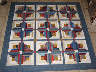
Back to business, as I posted a day or two ago, I have worked on this all week.
 |
| #039 "Simple Tribute"from pattern by Alice Berg published in June 2003 American Patchwork & Quilting. |
Here are a couple of close-up pics of some areas:
 |
| My way of easy 'mitering'. The pattern did not call for mitering, but I wanted the directional print to be mitered, so this is how I did it. |
 |
| Interesting how the gold star tends to look more like an 'X' or plus-sign on point and the white star (see below) doesn't so much. |
And actually ON my design wall? Well,, that would be these little blocks ... scrappy spools! They will finish at 3" and by the time I have actually said 'enough are enough', I will probably have enough for several quilts. But that's still a long way off in the future. I'm doing these as leaders/enders.
What's on your design wall? I think I'll check over at Patchwork Times and find out :)


I love the stars in the centers of the log cabins! I have never see this before. Lovely!
ReplyDeleteI too am fascinated by effects of different colors and values. I think the white star retains its "starness" because it contrasts with both the strip it is in and the surrounding fabrics, whereas the gold star blends with the strips and both contrast with the surrounding.
ReplyDeleteLog cabin is a great pattern, and your blue and tans works very well.